Sunday 29 November 2009

Pricelist development and Setting up the document for the pricelist


Size: 17 x 16 cm

I need to re-transform the existing price list for Nero.


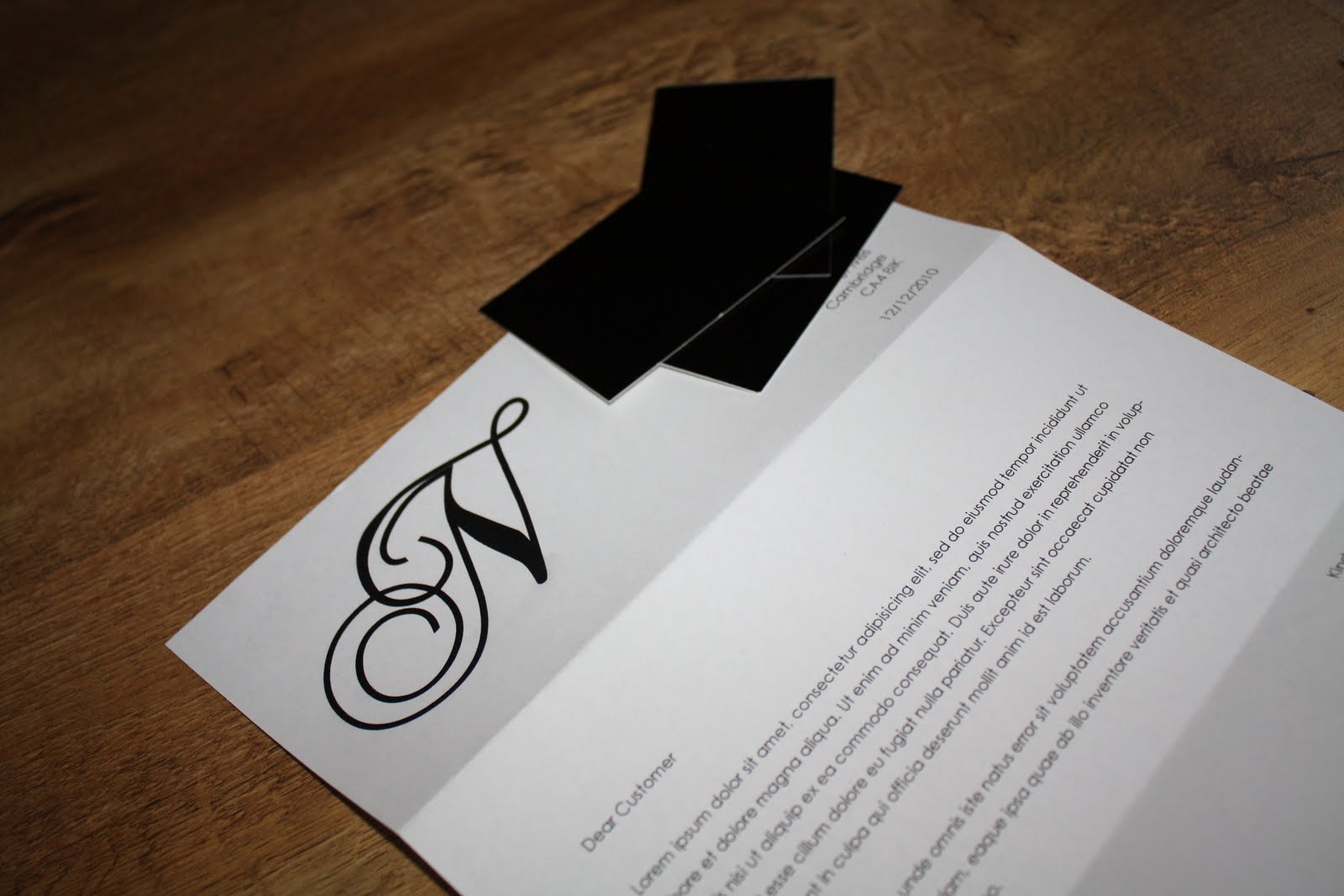
A quick layout to see how type and the logo would fit within the page.


This has to be the most tedious thing i've done so far. I typed out the information on the price list in their separate sections so i can place each thing on the page where i want it, rather than having to work with one whole list.


I have now arranged all the type to where i want it and sectioned it off so it will be easier for clients to find specific things they are looking for when they open the pricelist. As there was a lot of information to fit on there, i thought making a concertina pricelist would allow me to spread the information out without the information looking too crammed.


Front and Back of Pricelist


Mock Ups
The first test i did went wrong. I folded the pricelist wrong and therefore the text appears upside down when i put it together.


2nd attempt was much better :-)


Letterhead Development

Need to change the font of the information ho helvetica to keep it consistant with the business card.


Business Card and Letterhead together


Final Corporate Together


Splitting up the jobs

Now we have an identity to work with we have split the jobs up:

I will be designing:

>Letterhead and Pricelist

Lauren will be designing:

>Booklet and Loyalty Cards

Saturday 28 November 2009

Mirror Effect Stock


After doing this test, we found the N was very faint on the stock and you couldn't see it properly.

Tuesday 24 November 2009

Spot Gloss Test


After doing the spot gloss test in black and white, we found the black on black was the most effective. We printed on Matt paper, but we need to consider a thicker stock as the business card is still very flimsy and fragile.

Sunday 22 November 2009

Lazer Cut Test


Lazer Cut N's. They look so good, but will it be able to handle the glue when it goes through the screen? The design may rip!

After a chat with the technician in the screen print room, he said the only way we could use the foiling method was to make a screen and print the business card that way.

Me and Lauren then decided that this was a very long process for little business cards and making screens is a very time consuming process so we need to re-think how we could possibly get some kind of foil onto the paper.

Tuesday 17 November 2009

Foiling


Ive just prepared the document for the 'N' on our logo to get lazer cut. We needed to be careful as the curl on the 'N' was a bit thin and the last thing we want is the lazer cutter to rip the design. But we also look at the 'N' and be careful we dont loose the elegance of it as the weight of the stroke is increased.

Wednesday 4 November 2009

Final Chosen Logo

We incorporated both designs together and put together a final design for the business card.

Pitch to the client

See Lauren Oneills Blog.

Below is my pitch to the client. She really liked the layout of the back of my business card...but she did however like the front of Laurens design s it was simple. She also liked the circles on the letterhead design but she did think the circle business card was not appropriate for her business as it would be hard for people to fit them into their purses/wallets.

Logo in context

Tuesday 3 November 2009

Logo Development continued..

I felt one of my initial logo design worked really well. With the 'e' adding an almost unique feel to the logo with a traditional sans serif font around it.

Logo Development

After having a chat with lauren we decided the logo's needed developing further. The circle lauren created with the texture of hair in the background is something which we thought jumped out at us so we decided to develop this.


After developing this i decided the texture in the background almost washed out the type when it was placed on top. I also thought it made the logo look tacky and didn't relate to the salon itself, which has a very classy feel with chandlers and patent design around it.